
NPM_PACKAGE
@soroush.tech/markdown
Headless, composable markdown editor + renderer for @soroush.tech/design-system - Control, Toolbar, Editor, and Preview built on react-markdown, remark-gfm, and rehype-highlight.
$ npm i @soroush.tech/markdown @soroush.tech/design-systemA headless markdown editor and preview.
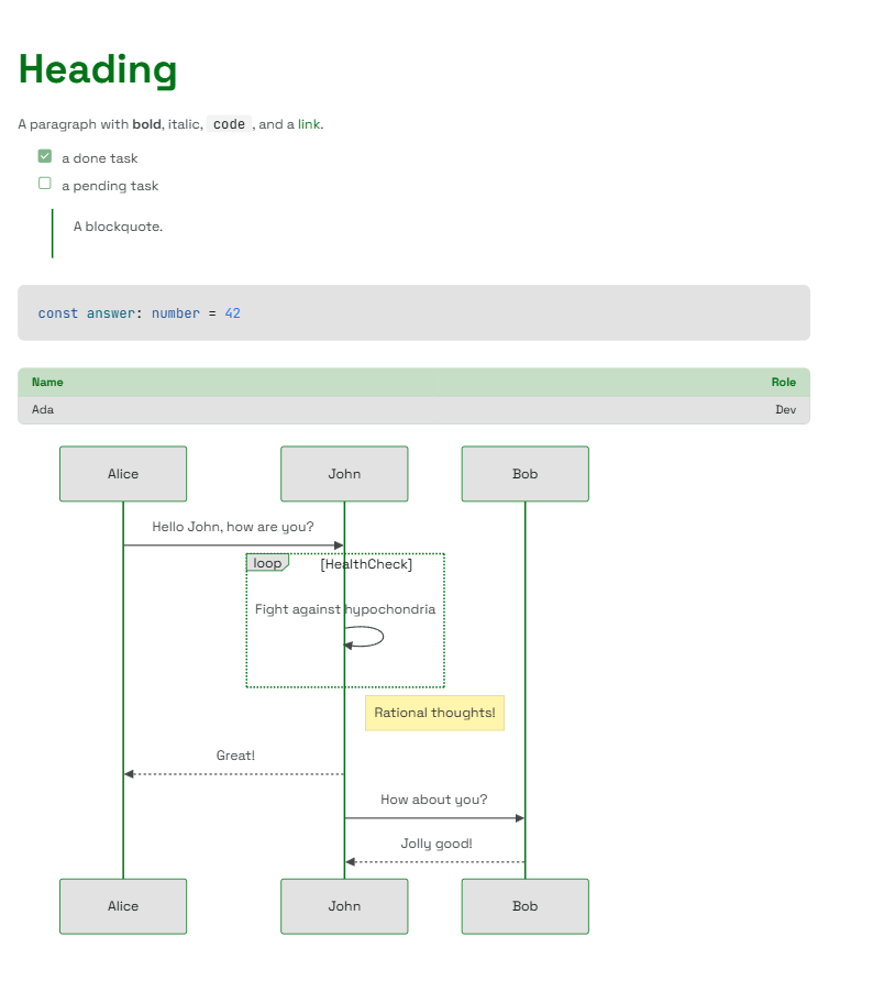
Compose a toolbar, a source editor, and a live preview however your UI needs - and every element is styled by your theme. The renderer works standalone too, turning any markdown string into themed components, with support for tables, task lists, strikethrough, autolinks, syntax-highlighted code, and mermaid diagrams.
Why headless?
Most markdown editors hand you a fixed widget - a bordered box with a toolbar bolted on top and an Edit/Preview toggle you can't move. This one gives you the pieces instead:
- You own the layout. Put the preview beside the editor, below it, in a modal, or drop it entirely - the parts don't care.
- You own the state. The value is yours (
useState, a form, a store); the editor just reads and writes it. - It looks like your app. Output is themed components -
Typography,Link,Table, and its ownCodeBlock- not unstyled HTML, so it inherits your theme with zero extra CSS.
Features
- GitHub-Flavored Markdown - tables, task lists, strikethrough, and autolinks.
- Syntax-highlighted code - fenced blocks are highlighted automatically; unknown languages degrade gracefully.
- Mermaid diagrams - a
```mermaidfence renders as a themed diagram with built-in zoom and pan controls, loaded lazily on the client and falling back to the source until it does. - A real editing surface - Tab-to-indent, selection tracking, caret restoration, formatting buttons, heading and code-language selects, a hover-grid table picker, and a diagram picker that inserts starter templates for 23 mermaid diagram types.
- Composable parts -
Control,Toolbar,Editor, andPreview, coordinated through React context. - Themeable to the slot - restyle the editor, toolbar, and preview through your theme, no forking required.
- Typed and SSR-safe - first-class TypeScript, 100% test coverage, no browser globals at module scope.
Install
# npm
npm install @soroush.tech/markdown @soroush.tech/design-system
# pnpm
pnpm add @soroush.tech/markdown @soroush.tech/design-system
# yarn
yarn add @soroush.tech/markdown @soroush.tech/design-system
Requires the design system. This package renders through
@soroush.tech/design-system, so its components must live inside that library'sThemeProvider. If you aren't already using the design system, start there first.
Quick start
Wrap your app in the design system's ThemeProvider once, then render markdown anywhere inside it:
import { ThemeProvider } from '@soroush.tech/design-system/theme'
import { Preview } from '@soroush.tech/markdown'

export function App() {
  return (
    <ThemeProvider>
      <Preview>
        {
          '# Hello\n\nRendered through your **theme** - tables, `code`, and [links](https://soroush.tech) included.'
        }
      </Preview>
    </ThemeProvider>
  )
}
That's the whole renderer. To let people write markdown, add the editing parts.
Editor
The Editor works standalone via value/onChange - no Control needed:
import { useState } from 'react'
import { Editor } from '@soroush.tech/markdown'
import { ThemeProvider } from '@soroush.tech/design-system/theme'

function MarkdownField() {
  const [value, setValue] = useState('# Start writing\n\nJust the source editor - no preview.')

  return (
    <ThemeProvider>
      <Editor value={value} onChange={setValue} />
    </ThemeProvider>
  )
}
A full editor and preview in a split screen
Everything inside Control shares one value and selection, so you arrange the panes freely. Here's a toolbar above a side-by-side source and live preview:
import { useState } from 'react'
import { Control, Toolbar, Editor, Preview } from '@soroush.tech/markdown'
import { Flex } from '@soroush.tech/design-system/Flex'

function MarkdownField() {
  const [value, setValue] = useState(
    '# Start writing\n\nType on the left, watch it render on the right. →'
  )

  return (
    <Control value={value} onChange={setValue}>
      <Toolbar />
      <Flex gap={4}>
        <Editor />
        <Preview>{value}</Preview>
      </Flex>
    </Control>
  )
}
There is intentionally no Edit·Split·Preview switch - which panes to show, and when, is your call.
The parts
| Part | Role |
|---|---|
Control | Headless provider - owns the value/selection state. Takes value + onChange. |
Toolbar | Formatting buttons, heading/code-language selects, and the table picker. |
Editor | The source <textarea> - Tab-to-indent, selection, caret restore. |
Preview | Renders a markdown string (its child) to themed components. |
Toolbar and Editor must be rendered inside Control; Preview works anywhere. Import each directly from the package - there is no Markdown.* namespace. Full prop references live in the source on GitHub.
Customizing the look
Everything is styled through the design system's theme, and there are two levels to reach for - a shared theme for the whole look, and per-component slots for the markdown parts specifically.
Customize the theme - restyle everything
Preview renders design-system components that read theme tokens, so your theme already governs how markdown looks. Build one with createTheme - palette, spacing, type scale, radii - and pass it to ThemeProvider; the markdown output changes along with the rest of your UI, no markdown-specific setup. See the design system's theming guide for the full token set.
import { ThemeProvider, createTheme, baseTheme } from '@soroush.tech/design-system/theme'

const theme = createTheme(baseTheme, {
  palette: {
    primary: {
      main: '#7C3AED',
      light: '#A78BFA',
      dark: '#5B21B6',
      contrastText: '#FFFFFF',
    },
  },
})

// <ThemeProvider theme={theme}> ... </ThemeProvider>
Customize the components - target the markdown parts
For tweaks specific to the editor, toolbar, or preview, this package registers three themeable slots under theme.components - MarkdownEditor, MarkdownPreview, and MarkdownToolbar:
const theme = createTheme(baseTheme, {
  components: {
    MarkdownPreview: { styleOverrides: { root: { maxWidth: '72ch' } } },
    MarkdownToolbar: { styleOverrides: { root: { gap: 4 } } },
  },
})
The overrides are fully typed - importing the package registers the slots on the theme automatically.
Building your own parts
Need a custom control or a word count? useMarkdownContext() exposes the same value, selection, and dispatch the built-in parts use - call it from any component inside Control.